
[ad_1]
Prompting GPT-4 to visualize global happiness data with Plotly

Effective, prompt engineering with AI can significantly speed up the Python coding process for complex data visualizations.
By providing modular, precise, detailed instructions, GPT-4 reduces low-level coding completely, allowing you to focus solely on implementing your solution.
As an example, to prove this concept, we will access a dataset containing global happiness data.
In four (4) hands-on modular steps, we display global happiness results on a map in plotly dash, AND create two interesting data visualization charts to tell a detailed story about the data.
Let’s get to it.
The first step involves loading and preprocessing the dataset. We have to read the CSV file, convert happiness scores to numeric, and then compute the average score for each country.
There are lots of versions of the happiness data set out on the internet. For example, you can download the dataset from HERE.
The dataset that I am using has data from 2015 to 2022. Here are the first 5 rows of the CSV file (happiness_years.csv):
Country,2015,2016,2017,2018,2019,2020,2021,2022
Switzerland,7.587,7.509,7.49399995803833,7.487,7.48,7.559899807,7.571,
Iceland,7.561,7.501,7.50400018692017,7.495,7.494,7.504499912,7.554,
Denmark,7.527,7.526,7.52199983596802,7.555,7.6,7.645599842,7.62,
Norway,7.522,7.498,7.53700017929077,7.594,7.554,7.487999916,7.392,7.365
Canada,7.427,7.404,7.31599998474121,7.328,7.278,7.23210001,7.103,
Now that we have a CSV file and we know the structure of the file, we can prompt GPT-4 to access the file and create a pandas data frame from it.
ChatGPT-4 prompt: Can you generate Python code to read ‘happiness_years.csv’ using pandas, convert ‘Happiness Score’ columns to numeric, and calculate the average happiness score for each country across all the years? The ‘Country’ column should be set as the index.
ChatGPT-4 response:
import pandas as pd
# Load the dataset
df = pd.read_csv('happiness_years.csv')
# Convert Happiness Score columns to numeric type and handle any conversion errors
for column in df.columns[1:]:
df[column] = pd.to_numeric(df[column], errors='coerce')
# Calculate the average happiness score for each country
df['Average Happiness Score'] = df.iloc[:, 1:].mean(axis=1)
df.set_index('Country', inplace=True)
In this block, we load the dataset from the CSV file using pandas.
For each column except the first (which contains country names), we convert its values to a numeric type. If any value fails to convert, ‘coerce’ ensures it will be replaced with ‘NaN’.
Afterward, we calculate the average happiness score across all years for each country and add it to the dataframe as a new column.
Lastly, we set ‘Country’ as the index for easier data manipulation later on.
Now, we’ll load the JSON file to help us identify each country for our map.
ChatGPT-4 prompt: Could you provide Python code to read a JSON file named ‘world-countries.json’ using the json module?
ChatGPT-4 response:
import json
# Load the JSON file
with open('world-countries.json') as file:
countries = json.load(file)
This code reads the ‘world-countries.json’ file, which we’ll use later to map the country names to their geographical shapes on our choropleth map.
With the data now preprocessed, we’ll use Plotly Dash to create a choropleth map that displays the average happiness score for each country.
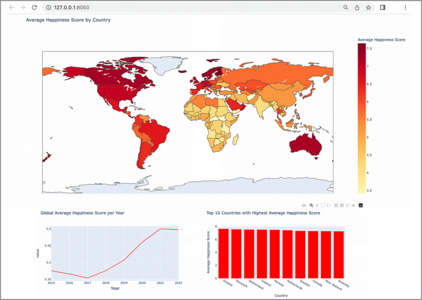
ChatGPT-4 prompt: Could you generate Python code to create a Plotly Dash app and a choropleth map that displays the average happiness score by country, using data from our pandas DataFrame and our JSON file? Please ensure that the map fills up most of the display window and has a “happy” color scheme.
ChatGPT-4 response:
import dash
import dash_core_components as dcc
import dash_html_components as html
import plotly.express as px# Initialize the Dash app
app = dash.Dash(__name__)
# Create the choropleth map
fig = px.choropleth(df.reset_index(), locations='Country',
locationmode='country names',
color='Average Happiness Score',
hover_name='Country',
title='Average Happiness Score by Country',
color_continuous_scale=px.colors.sequential.YlOrRd)
# Define the app layout
app.layout = html.Div([
dcc.Graph(figure=fig, style='height': '80vh')
])
# Run the app
if __name__ == '__main__':
app.run_server(debug=True)
This snippet initializes the Dash app and then generates a choropleth map using Plotly Express.
NOTE: GPT-4 doesn’t have info for the most recent dash library. The import statements should be revised to remove warnings on application load.
In the above code, replace these two lines:
import dash_core_components as dcc
import dash_html_components as html
With these two lines:
from dash import dcc
from dash import html
Our dataframe and the average happiness score are supplied as data inputs to the map. The locationmode parameter is set to ‘country names’, which corresponds to our ‘Country’ column.
We also set the color scale to ‘YlOrRd’ – a happier, warm color range from yellow to red.
The map is then defined as the layout of our Dash app with a large height to occupy a significant portion of the display window.
Having successfully rendered the average happiness score by country on a choropleth map, we now create two more charts that delve deeper into global happiness trends. We’ll place these charts side by side to make comparative analysis easier.
ChatGPT-4 prompt: Could you generate Python code to create two additional charts that elucidate global happiness trends? Let’s create a line chart illustrating the global average happiness score per year and a bar chart that displays the top 10 countries with the highest average happiness score. Please make sure the charts are placed side by side and the color theme for the charts is red.
ChatGPT-4 response:
# Calculate the global average happiness score per year
global_avg = df.iloc[:, :-1].mean()
# Create line chart
fig2 = px.line(global_avg, title='Global Average Happiness Score per Year', color_discrete_sequence=['red'])
# Calculate the top 10 countries with highest average happiness score
top_10 = df['Average Happiness Score'].sort_values(ascending=False).head(10)
# Create bar chart
fig3 = px.bar(top_10, x=top_10.index, y='Average Happiness Score',
title='Top 10 Countries with Highest Average Happiness Score', color_discrete_sequence=['red'])
# Update the app layout to include the new charts
app.layout = html.Div([
dcc.Graph(figure=fig, style='height': '80vh'),
html.Div([
dcc.Graph(figure=fig2, style='height': '40vh', 'display': 'inline-block'),
dcc.Graph(figure=fig3, style='height': '40vh', 'display': 'inline-block')
])
])
# Run the app
if __name__ == '__main__':
app.run_server(debug=True)
In this block, we first compute the average happiness score globally for each year.
Using this data, we create a line chart, which allows us to trace the fluctuation in global happiness over time.

Then, we determine the top 10 countries with the highest average happiness score and visualize this data in a bar chart. Both charts are set to a red color.

The two charts are included side by side in the app layout by using the ‘display’: ‘inline-block’ property.
This makes for a comprehensive dashboard of global happiness trends. Finally, the Dash app is ready to run and display our visualizations.
Beautiful results! You can fiddle around with layouts and colors to get a different look and feel.
You may also choose to change the types of charts that are being displayed. For example, the top 10 countries may show better as a horizontal bar. Or you could create a scatterplot to show the variance.
By approaching this problem in a modular fashion, it is easy to go back to step 4 and prompt for a different set of charts.
I hope you found this interesting — and useful!
The use of prompt engineering, particularly in a step-by-step modular approach, allows for better interaction with AI models like ChatGPT-4,
By approaching AI in this manner, you can spend more time thinking about what the data can do and how to ask the right question(s), rather than spending a significant chunk of your time fiddling with data frame and library-specific syntax.
Prompt engineering can accomplish a task, like the one presented here, in record time.
This interaction, this step-by-step modular interfacing between humans and AI, will drive innovation in data visualization going forward.
Period.
[ad_2]
Source link